May
22
2010
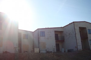
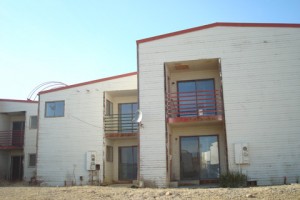
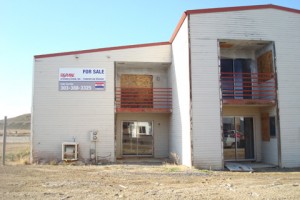 Recently on a trip to Grand Junction, Colorado, I stumbled upon this rundown condo complex. Being a native of Grand Junction, I watched this complex get built, and so was totally floored with how much it had gone into disrepair. This complex was built around 1983 about the time of the big bust in Grand Junction. While certainly not high quality construction in the first place, they were still rather nice condos for the time. My guess is these were used as rentals over the last couple of decades, and not maintained at all. I knew that the landscape had died some time ago, but I was still amazed to see how fast something that can fall apart due to lack of maintenance. These buildings will need to be gutted and almost rebuilt if they are to come back. Of course, then there is also the issue of the ridiculously small windows that were common in that time period. I will have to check back from time to time to see if anything happens with these.

no comments | tags: Development, ugly | posted in Development, Fugly
Mar
12
2009
One of the things I like to do is to visit different locations using Google Earth. I find this to be a fantastic tool to virtually visit areas around the globe that I have never been too. It is rather fascinating to see some of the various development patterns is different cities, towns and countries. With street view, it becomes even more fascinating to actually get on the street and see stuff, do 360 degree views and so on. Doing this for awhile, it finally hit on me, that I should actually blog about my visits, talk about what I see, and share my thoughts. Of course this will be done with very little or no knowledge of local politics, history and what not. I look forward to seeing the comments from my readers as well.
no comments | tags: Development, new urbanism, street scape, sustainability, ugly
Jun
9
2008

OK, this belong more in the WTF category than ugly. I found this playground in a New Urbanism community. Not just any community, but a very celebrated one that prides itself on its high end and well regulated architecture. So why on earth would they fence in a playground….much less with a chain link fence? I haven’t seen chain link fences anywhere else in the community, so I didn’t think they were even allowed.
Now I can understand wanting to keep kids out of the street…but there are far better ways of doing it…wrought iron fence comes to mind, with some openings to actually get into the playground. I don’t know, all I do is shake my head.
no comments | tags: Fugly, ugly | posted in Fugly
Feb
2
2007

OK, so I am a couple of days late posting, but I found this one in January! This wonderful project is a perfect example of what not to do for project planning and streetscape design! This particular apartment project is in Castle Rock, Colorado, next door to one of my projects. They both were designed and approved roughly at the same time, but what a difference in concepts and execution!
The apartment home site was originally a beautifully sloping site vegetated with scrub oak and other native plants. The developers of the apartment homes probably had a standard building plan they wanted to use (usually on flat sites), so in order to get that product to work on this site, they had to construct some incredible retaining walls to pull this off. The picture shows the result of what happened along the public street adjacent to the site. Not only are the walls incredibly tall (around 40 feet at one point), they were designed without any anesthetics in mind. There is no variation in color, no pattern, nothing. Just a huge homogeneous wall. Then, they didn’t even bother to screen it plant material, trees, or shrubs. Just a few trees scattered here and there. Ugly.
Watch for my other post of our project coming up shortly.
no comments | tags: Fugly, street scape, ugly | posted in Fugly
Dec
6
2006


The other day I was driving down C-470 in south Denver, when my eye was caught by this housing development. I simply had to get off the interstate and explore this one…and I could not believe my eyes! This has to be one of the worst developments I have seen, particularly for townhomes! The first picture is what you see when you first drive into the development…nothing but a solid row of garage doors! There is no focal point, there is no sense of community, no sense of arrival. Nothing but a series of garage doors. The other side of the buildings isn’t much better. This is what visitors see when they come to your home…nothing but lined up porches, with little to break it up, or identify one unit from the next. In the front there isn’t even any differentiation in the architecture…talk about boring!
I am blown away by three things…that a developer would build something like this, that a jurisdiction would approve it…and even more surprised that buyers would buy this! Granted, this parcel of land was landlocked between two apartment complexes, and was long and narrow, but I would think that something else could have been done. Something to give this development some sense of arrival, some focal point. Sacrifice a few units to create something special. How about being proud of something that you build?
no comments | tags: Fugly, ugly | posted in Fugly
 Recently on a trip to Grand Junction, Colorado, I stumbled upon this rundown condo complex. Being a native of Grand Junction, I watched this complex get built, and so was totally floored with how much it had gone into disrepair. This complex was built around 1983 about the time of the big bust in Grand Junction. While certainly not high quality construction in the first place, they were still rather nice condos for the time. My guess is these were used as rentals over the last couple of decades, and not maintained at all. I knew that the landscape had died some time ago, but I was still amazed to see how fast something that can fall apart due to lack of maintenance. These buildings will need to be gutted and almost rebuilt if they are to come back. Of course, then there is also the issue of the ridiculously small windows that were common in that time period. I will have to check back from time to time to see if anything happens with these.